Navigation
Install the app
How to install the app on iOS
Follow along with the video below to see how to install our site as a web app on your home screen.

Note: this_feature_currently_requires_accessing_site_using_safari
More options
You are using an out of date browser. It may not display this or other websites correctly.
You should upgrade or use an alternative browser.
You should upgrade or use an alternative browser.
A New Logo For Ecigssa - By The Community!
- Thread starter Gizmo
- Start date
Ok brainfart.... what if we had a burning cig, with a lightening bolt coming out of the vaper coming from the cig?
I personally and professionally feel we should avoid the smoke imagery as much as possible.
Above and beyond the message it might convey, it often translates poorly in logo's.
But I can see if some squeeze comes forward from the idea nonetheless.
How about sharks? Sharks with friggin laser beams!I personally and professionally feel we should avoid the smoke imagery as much as possible.
Above and beyond the message it might convey, it often translates poorly in logo's.
But I can see if some squeeze comes forward from the idea nonetheless.
How about sharks? Sharks with friggin laser beams!
And and .. With a Darth Vader helmet on and the words "Wies Jou Pappa" tattooed on his chest
All possible. Example:
View attachment 8987
Remove flag from "SA" and apply to icon instead, etc etc.
So far, I've gotten the most positive feedback on the cig/leaf icon, and will move forward into 3 main drafts to progress from based on that.
Hi @WHeunis
I commend you sir for your efforts thus far. Thanks so much!
Regarding the above logo - I like it a lot - it looks clear.
Just a small gripe I have with it:
I personally don't like the way the end of the "C" is shaped in the ECIGS. It looks like ashes of a cigarette to me.
Lol @Andre - not a chance! My choice would most likely be Arial font large enough to read with minimal colour, a bit like a drawing title 
I too dislike the term 'ecig' because of the connotations, but I guess there's little choice considering the name of this place.
I think you have the right man for the job, and I can appreciate his difficulty - designing for a committee can be very frustrating. Hang in there @WHeunis , you're doing great!
Can we have some sheep in there somewhere? ... just a thought ...
Hi @WHeunis
I commend you sir for your efforts thus far. Thanks so much!
Regarding the above logo - I like it a lot - it looks clear.
Just a small gripe I have with it:
I personally don't like the way the end of the "C" is shaped in the ECIGS. It looks like ashes of a cigarette to me.
Excellent feedback, much appreciated.
The end of the C is conceptually a VV dial (i'm not overly fond of it myself, kind of a vestigial tail from the power-icon concept that has just kinda dragged along for the ride, lol), and as with all things conceptual - additions and removals will still be plenty.
Been playing around with Ideas but will try again tomorrow
Good job bro. I'm really liking the top one. Bottom one looks cool too, the logo gets a bit lost in the busy - ness of the flag.Some variations on the 'leaf' logo theme. Excuse the quality - my CAD program is not really suitable for this sort of thing. I also think that there's nothing much wrong with the current logo, but an update to include a PV as Oupa suggested would look cool.
View attachment 8994 View attachment 8995
Top is a winner to me!
Guys who of us really sought out "vaping" when we were looking to quit? In my mind, vaping was something you do with weed. I get that it's not nice to be associated with it, but are we looking to turn this into a boys club or are we trying to make a community that strives to improve peoples' lives and promote a healthier alternative to what 90% us are moving away from, cigarettes?
Secondly I think the admins should try and set some criteria, or perhaps even issue a poll or two to try and narrow the design constraints down a little. Are we going to embrace the current trend of clean, flat designs, or are we looking to be a bit more homely with it. This could also include broad decisions like format, such as logo - ECSA vs a badge format like 360 came up with (I’m not sure that’d fit the current website design).
Lastly, I agree with someone saying we shouldn't be representing a cigarette too directly with regard to the “ash” or embers. That is why I think the stick with a leaf is the most effective logo so far - it's a green version of a cancer stick. Also is it necessary to be as specific as having a VV control in the logo? Can it be interpreted correctly even? To me it's not enough of a defining feature and I would go as far as to say a glowing coil is a better representation of our toys as a whole.
As much as it is not (publicly) known, the parameters have indeed been set. Format, colours, and other such factors have already been tabled.
Is the VV dial necessary? Is the letter E necessary? Is that particular shade of blue really the right one?
It's all part of the process. Design by committee is a tougher bag to hold together, and has a different process than a 1-on-1 process. In 1-on-1 it is MUCH simpler; Client doesn't like the VV dial, ditch the VV dial!
In committee design, one often rotates certain elements as often and as varied as possible - just to see what sticks; Just to see what brings up any amount of positive or negative comments.
Are some of the concept boards more than imperfect? YES! They are almost MEANT to be more than just imperfect. No matter how 3-year-old's-skills somebody's MS Paint submission might be, it COULD contain something that multiple people might have a comment on.
"ooooooh! I like that spikey thing!" - step by step. Even when something draws zero response, it has some amount of value to the final design.
Things get added, removed, refined and reworked on a constant basis to find something that works and that the majority of the committee can feel comfortable with.
I'm glad so many people like the leaf/stick motif. I'm glad that nobody commented on the power symbol G. I'm glad that somebody mentioned they think the VV dial looks like stinky-ash. I'm glad that somebody said they don't like this, that or the other.
At this point in time, almost anything is up for iterations. Other's are not on the table YET, and as such, it's feedback is noted but not adjusted.
I hope this helps to better understand where we are, and also where were going at the moment.
And now...
The distilled draft elements that need further feedback.
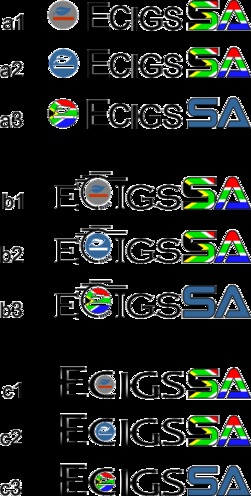
Each of the 3 main different concepts that have received the most positive feedbacks are laid out above.
I need TWO things for feedback from these concepts.
1: Which LAYOUT do you prefer? A has the icon separate. B has the icon integrated into STYLIZED text, and C has the icon integrated into REGULAR text.
2. Of the LAYOUT you choose, which BASE COLOUR ARRANGEMENT do you prefer? 1's, 2's, and 3's across the board are the same base colour arrangements for that layout. A fourth option exists, where you can word out some colour arrangements of your own choosing. (Ex: "I like Blue colours on both the icon and the SA, i dont like flag colours, etc")
Please note that at this point, Font, precise colour shades, specific elements to add or remove, sizes, etc are not yet open, but your comments on any such properties will be noted for later use in the process.
Just because you don't like the font of a layout, does not immediately mean anything. OF COURSE we can make layout C more wild! OF COURSE we can calm down the spikey-ness of the letters in layout B! OF COURSE we can use rounder characters for layout A!
I mainly need to know where/how you like the icon to be placed, and which base colour arrangement are your favorites (ESPECIALLY, if at all, the flag colouring).
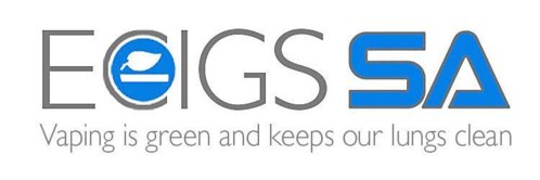
I don't have illustrator anymore, but here's a rough blast of that and a cheesy catchphrase (it's 1am ok)
View attachment 9002
Actually, that would be C...
Somewhere between the two, close enoughI just worked from what was left open in PS.
Also... don't use commercial fonts for this particular project.
Free/GPL materials only.
The Halis Grotesque font is under commercial license: http://www.myfonts.com/fonts/ahmet-altun/halis-gr/
Good point. Actually using Gill Sans however. Thought it better to use something that actually looks decent for now - not to mention that I won't actually be doing the actual thing. I could probably get similar results using Google's Ubuntu.. I think that's free? Could be confused
- EDIT- the company I worked for provided a whole stack of fonts for us to use in our presentations, never did "graphic design" work
- EDIT- the company I worked for provided a whole stack of fonts for us to use in our presentations, never did "graphic design" work
Last edited:
Good point. Actually using Gill Sans however. Thought it better to use something that actually looks decent for now - not to mention that I won't actually be doing the actual thing. I could probably get similar results using Google's Ubuntu.. I think that's free? Could be confused..
Gil Sans MT is GPL, but none of the other variants, including the base, is.
So, as long as it's MT, it qualifies as free.
Some variations on the 'leaf' logo theme. Excuse the quality - my CAD program is not really suitable for this sort of thing. I also think that there's nothing much wrong with the current logo, but an update to include a PV as Oupa suggested would look cool.
View attachment 8994 View attachment 8995
I think the first one's shape doesnt suit the design of the site
I think the writing in the second one gets a bit lost
As much as it is not (publicly) known, the parameters have indeed been set. Format, colours, and other such factors have already been tabled.
Is the VV dial necessary? Is the letter E necessary? Is that particular shade of blue really the right one?
It's all part of the process. Design by committee is a tougher bag to hold together, and has a different process than a 1-on-1 process. In 1-on-1 it is MUCH simpler; Client doesn't like the VV dial, ditch the VV dial!
In committee design, one often rotates certain elements as often and as varied as possible - just to see what sticks; Just to see what brings up any amount of positive or negative comments.
Are some of the concept boards more than imperfect? YES! They are almost MEANT to be more than just imperfect. No matter how 3-year-old's-skills somebody's MS Paint submission might be, it COULD contain something that multiple people might have a comment on.
"ooooooh! I like that spikey thing!" - step by step. Even when something draws zero response, it has some amount of value to the final design.
Things get added, removed, refined and reworked on a constant basis to find something that works and that the majority of the committee can feel comfortable with.
I'm glad so many people like the leaf/stick motif. I'm glad that nobody commented on the power symbol G. I'm glad that somebody mentioned they think the VV dial looks like stinky-ash. I'm glad that somebody said they don't like this, that or the other.
At this point in time, almost anything is up for iterations. Other's are not on the table YET, and as such, it's feedback is noted but not adjusted.
I hope this helps to better understand where we are, and also where were going at the moment.
And now...
The distilled draft elements that need further feedback.
View attachment 9000
Each of the 3 main different concepts that have received the most positive feedbacks are laid out above.
I need TWO things for feedback from these concepts.
1: Which LAYOUT do you prefer? A has the icon separate. B has the icon integrated into STYLIZED text, and C has the icon integrated into REGULAR text.
2. Of the LAYOUT you choose, which BASE COLOUR ARRANGEMENT do you prefer? 1's, 2's, and 3's across the board are the same base colour arrangements for that layout. A fourth option exists, where you can word out some colour arrangements of your own choosing. (Ex: "I like Blue colours on both the icon and the SA, i dont like flag colours, etc")
Please note that at this point, Font, precise colour shades, specific elements to add or remove, sizes, etc are not yet open, but your comments on any such properties will be noted for later use in the process.
Just because you don't like the font of a layout, does not immediately mean anything. OF COURSE we can make layout C more wild! OF COURSE we can calm down the spikey-ness of the letters in layout B! OF COURSE we can use rounder characters for layout A!
I mainly need to know where/how you like the icon to be placed, and which base colour arrangement are your favorites (ESPECIALLY, if at all, the flag colouring).
You're a champ @WHeunis
To answer your 2 questions:
1. On layout I prefer "A" - the top one - because its clearer
2. Of those, A2 is my preferred choice because once again the blue icon is the clearest and most striking
C2 would be my second choice, but I think A2 is clearer with the icon on the left
The "B" option is not as clean and pleasing to my eye and i dont like the ashes on the letter C
Similar threads
- Replies
- 0
- Views
- 724
- Replies
- 0
- Views
- 608
- Replies
- 1
- Views
- 770
- Replies
- 3
- Views
- 808



 in the mix but