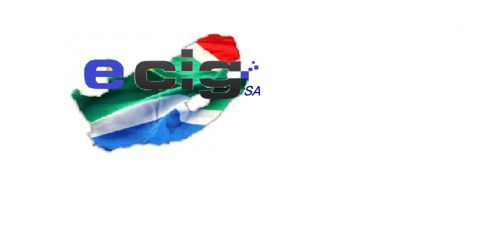
I don't have illustrator anymore, but here's a rough blast of that and a cheesy catchphrase (it's 1am ok)
View attachment 9002
Nice @Mike
I like the clean lines.
Follow along with the video below to see how to install our site as a web app on your home screen.

Note: this_feature_currently_requires_accessing_site_using_safari
I don't have illustrator anymore, but here's a rough blast of that and a cheesy catchphrase (it's 1am ok)
View attachment 9002

")
Love the font, but not sold on the bird.View attachment 9068
I have the creative skills of a wet noodle, but in the spirit of things I put together something that appeals to me.
I like clean lines and here is my contribution. Bear in mind no fancy software was used for this all... but if it broadens the scope and someone with real design skills can build on it, then all's good.
")
This is just an idea, done on paint, and its not done good. But just an idea...
but agree with the no flag colours...
I would like to vote for no styling on the letter C
Just the plain letter
 Especially
  (AMAZING talent there!!)