The ideal vaping website - tips from the community

You guys pretty much summed it up for me.

Bad idea:
- Popups (They wont admit this, but its not always a 'Live' representation, its a psychological sales tactic thing to get consumer more eager to make a decision to buy something, much like a auction, so people buy because of FOMO if they see there are 2 left and Jan just took one)
- Different pages for the same thing
- Different page for different ML juices
- Weird hidden difficult to navigate menus
- Having too many Categories
- No Image for product available
- No stock that is still displayed
- Dead links
- One page for all products

Good Idea:
- Clear and Various Images of the actual product, Like Sir Vape (Not supplier images)
--- Especially on things like Stab Wood and resin Mods (I like how Sir Vape lists These)
- Simple Navigation (Clyrolinx and Vaporize.coza Site is a bit Hide and Seeky, difficult to find things)
- Loyalty points (That are actually worth something)
- Filters to better define results
- Clear contact details and location, Not a webform that I have to fill in and hopefully get a call
- Up to date (Remove old keep new updated)
- SUPPORT THE PRODUCTS YOU SELL. For instance if I buy a tank from you with prebuilt coils, then I would like to be able to get a replacement coil from you for at least 12 months after purchase. Dont sell things that are discontinued

So yeah, basically everything everyone said.

And thats my
1*VM4QgVeRrlBxGyvk4F1snw.png

@Dietz I agree with you about the coils. In fact, the coils should appear right next to the mod, as well as in the coils section.
 
Keyboard, Check
Screen, Check
Coffee, Check

Here goes:
For the purposes of this I think breaking it down in a couple of steps is called for. Also using a comparative approach between the virtual and B&M experience is thought to get the ideas across more prominently.

First up, first contact.
When entering a store,stepping over the threshold, there are a few things that set the tone of ones perception of the store as well as lay the foundations of the clients perception of the remainder of his experience there.

Imagine having to wait for electronically operated doors to open and these take their leisurely time to first show any sign of reaction and then open at a snails pace. Once open wide enough for you to enter, (The doors still continuing to open behind you) you step in to be met with a cacophony of promotional displays which may or may not be related to what you are there for. Worst of all, once you find your way through these displays and promotional materials, the store layout remains maze like in appearance and no logical organizational pattern is easily apparent. Cash Converters (some), Dion Wired, HiFi Corruption, Edgars... I'll rather shop at Game and Macro, thanks.

What I want is to walk in the door and be able to immediately understand the layout, the total scope of products available and plan my path to the points of interest that were my motivation for going there in the first place. No, your Samsung curved TV range display may be nice but I am here to buy earphones and I can not see where I might find them because the displays are blocking my view. Also, where the hell is the info desk? The tills? About turn!

The same applies to virtual store environment. Opening a web page that takes ages to load due to a scrolling picture bar displaying mostly products that I am not here to look at, just to be confronted with these being displayed while the important stuff is still being loaded... Nooit man, I'm outta here, your'e wasting my time and data. And as we know Time is Money and so is Data. Oh! I forgot to add, when these pictures are different sizes and the page below them "jumps" up and down as it adjusts to their layout, you will never see me again.

A stores home page should be clearly but tastefully branded so I know where I am and display provide me with a clear and uncluttered path to the virtual "isles" i wish to take a look at. So this means I want to be met with a list of menu items representing these isles which clearly describes what I can find there. This without having to scroll down and search for it. It should be the central focus of the page. Below that static displays of promotional goods or links to certain areas of the site are welcome but until I have a proper understanding of my surrounds I will in fact not be paying any attention to them. Basic human nature.

The following is the perfect example of what I mean:
upload_2018-6-2_11-8-19.png
It's all there is it not? I am not overpowered by anything and although there is a subscribe link and chat (Offline) link, they are out of the way and not obtrusive at all.

Next up:
The menu's aka Isle layout. But that will need to be another post, this one is getting to long.

Regards
 
Isle Layout:

Pick n Pay went through a stage where their isle layouts went completely insane. Mayonnaise would be found with the sandwich spreads and Doom would be shelved with the spray on deodorants.

This is however where it can get tricky. The natural logic of things would determine that items of similar nature be grouped together in different sections of the same isle or menu item. But what is the grouping criteria to be? All shiny stuff one side, all HE stuff the next? Don't laugh, I have come across a site that had something similar going.

Walking into a B&M vape hypermarket, an imaginary store, selling every vape related product ever conceived, one would expect to find groupings of isles for key product themes such as atomizers, mods, dyi, accessories, juice and so on. Each grouping would then possibly have isle dedicated to more specific groupings such as the above atomizer section would have full isles dedicated to RTA' and Sub Ohm tanks, RDA's and RDTA's. Juices probably divided into isles according to profile, coffee, menthol, fruit, bakery and so on.
The individual isles then sub divided into sections such as single coil RTA's, dual coil RTA's, HE DL Drippers, MTL drippers, Local juice, international juice
and so on.
The above would work great for the super massive store but would sure as taxes not work for a B&M corner shop which would most possibly have a single isle for all their hardware and another for all their consumables. However identifying these as "hardware" and "Consumables" would be of little guidance to the consumer seeking the shortest route to a specific item. Equally though, having a whole isle dedicated to RBA's on the far side of the shop, dedicated to a single product, would be just as frustrating.

Fortunately, the virtual world allows us to have as many isles and groups as we wish, even being able to display the same item in more than one isle if we wish. Be aware however that the redundant use of sub menus can also result in a negative user experience. The following would be a frustrating scenario to get to a specific product: Hardware>Mods>Dual Battery>Regulated>IJoye>. Well, that is not exactly true, is it. If you had 15 Ijoye mods of that description available it would work to group at this level but having to go through four sub menus to get there would still be a pain in the butt.
For this level of specific selection rather provide a search function that allows selecting based on the specific criteria. Keep menu structures as simple as possible based on the range of options available in your store.
If you only sell 10 atomizers in total, do not create a grouping for each type. Have a main item "Atomizers" and that's it. If you have a selection of more than one display page, have options for sub categories as each category complies to the one page rule. As an example, you sell 30 atomizers, 17 rebuildables and 13 sub ohm, then have these as sub menus under the atomizer main menu item. BUT! allow me to select all or the sub menu item, do not force me to select only one and please do not force me to select a main item called something like "Hardware" first.

The above is expressed a bit clumsy, sorry for that. Hope it at least gets the ideas wishing to be communicated across in any case.

Next: Shelf layout.

Regards
 
Keyboard, Check
Screen, Check
Coffee, Check

Here goes:
For the purposes of this I think breaking it down in a couple of steps is called for. Also using a comparative approach between the virtual and B&M experience is thought to get the ideas across more prominently.

First up, first contact.
When entering a store,stepping over the threshold, there are a few things that set the tone of ones perception of the store as well as lay the foundations of the clients perception of the remainder of his experience there.

Imagine having to wait for electronically operated doors to open and these take their leisurely time to first show any sign of reaction and then open at a snails pace. Once open wide enough for you to enter, (The doors still continuing to open behind you) you step in to be met with a cacophony of promotional displays which may or may not be related to what you are there for. Worst of all, once you find your way through these displays and promotional materials, the store layout remains maze like in appearance and no logical organizational pattern is easily apparent. Cash Converters (some), Dion Wired, HiFi Corruption, Edgars... I'll rather shop at Game and Macro, thanks.

What I want is to walk in the door and be able to immediately understand the layout, the total scope of products available and plan my path to the points of interest that were my motivation for going there in the first place. No, your Samsung curved TV range display may be nice but I am here to buy earphones and I can not see where I might find them because the displays are blocking my view. Also, where the hell is the info desk? The tills? About turn!

The same applies to virtual store environment. Opening a web page that takes ages to load due to a scrolling picture bar displaying mostly products that I am not here to look at, just to be confronted with these being displayed while the important stuff is still being loaded... Nooit man, I'm outta here, your'e wasting my time and data. And as we know Time is Money and so is Data. Oh! I forgot to add, when these pictures are different sizes and the page below them "jumps" up and down as it adjusts to their layout, you will never see me again.

A stores home page should be clearly but tastefully branded so I know where I am and display provide me with a clear and uncluttered path to the virtual "isles" i wish to take a look at. So this means I want to be met with a list of menu items representing these isles which clearly describes what I can find there. This without having to scroll down and search for it. It should be the central focus of the page. Below that static displays of promotional goods or links to certain areas of the site are welcome but until I have a proper understanding of my surrounds I will in fact not be paying any attention to them. Basic human nature.

The following is the perfect example of what I mean:
View attachment 133985
It's all there is it not? I am not overpowered by anything and although there is a subscribe link and chat (Offline) link, they are out of the way and not obtrusive at all.

Next up:
The menu's aka Isle layout. But that will need to be another post, this one is getting to long.

Regards

@Raindance An amusing, but sadly apt, description of what we go through on most vendors' websites.
 
Keyboard, Check
Screen, Check
Coffee, Check

Here goes:
For the purposes of this I think breaking it down in a couple of steps is called for. Also using a comparative approach between the virtual and B&M experience is thought to get the ideas across more prominently.

First up, first contact.
When entering a store,stepping over the threshold, there are a few things that set the tone of ones perception of the store as well as lay the foundations of the clients perception of the remainder of his experience there.

Imagine having to wait for electronically operated doors to open and these take their leisurely time to first show any sign of reaction and then open at a snails pace. Once open wide enough for you to enter, (The doors still continuing to open behind you) you step in to be met with a cacophony of promotional displays which may or may not be related to what you are there for. Worst of all, once you find your way through these displays and promotional materials, the store layout remains maze like in appearance and no logical organizational pattern is easily apparent. Cash Converters (some), Dion Wired, HiFi Corruption, Edgars... I'll rather shop at Game and Macro, thanks.

What I want is to walk in the door and be able to immediately understand the layout, the total scope of products available and plan my path to the points of interest that were my motivation for going there in the first place. No, your Samsung curved TV range display may be nice but I am here to buy earphones and I can not see where I might find them because the displays are blocking my view. Also, where the hell is the info desk? The tills? About turn!

The same applies to virtual store environment. Opening a web page that takes ages to load due to a scrolling picture bar displaying mostly products that I am not here to look at, just to be confronted with these being displayed while the important stuff is still being loaded... Nooit man, I'm outta here, your'e wasting my time and data. And as we know Time is Money and so is Data. Oh! I forgot to add, when these pictures are different sizes and the page below them "jumps" up and down as it adjusts to their layout, you will never see me again.

A stores home page should be clearly but tastefully branded so I know where I am and display provide me with a clear and uncluttered path to the virtual "isles" i wish to take a look at. So this means I want to be met with a list of menu items representing these isles which clearly describes what I can find there. This without having to scroll down and search for it. It should be the central focus of the page. Below that static displays of promotional goods or links to certain areas of the site are welcome but until I have a proper understanding of my surrounds I will in fact not be paying any attention to them. Basic human nature.

The following is the perfect example of what I mean:
View attachment 133985
It's all there is it not? I am not overpowered by anything and although there is a subscribe link and chat (Offline) link, they are out of the way and not obtrusive at all.

Next up:
The menu's aka Isle layout. But that will need to be another post, this one is getting to long.

Regards

@Raindance I agree that @Sir Vape's layout is good, but his new arrivals are the ones to which I was referring in an earlier post - 80 pages of new arrivals. Not likely! Yes, one can sort them from the newest (I think that is the default sorting) but when I go to New Arrivals I expect to see New Arrivals ONLY. Surely the IT guys managing the site can separate New Arrivals from the other juice?
 
1) State your shipping fees without me having to register and checkout to find out :rolleyes:... actually a deal breaker

2) If it is out of stock and you're not planning to bring more stock in... take it off the damn site
 
When it comes to a vape website - for the most part I do look for a professional layout. If the website appears to be “slapped together” and poorly thought out I’m going elsewhere because it gives me the impression the owner(s) of the website/company may be chancers. Another reason why I don’t like web forms to submit queries. I want to see a working email address that I can use along with a telephone number and location details.

When I arrive at a website, I head straight for the search function (if I know what I want) and if a website doesn’t have one, I normally leave in a hurry. Also, when using the search function, I don’t want to sort through pages and pages of irrelevant items to finally arrive at the product I’m after. I like search bars that, when you type in the item you’re looking for, it pops up. Vape Cartel have this feature.
Makes life a lot easier.

Finally, exactly what @Smoke_A_Llama said - state your shipping fees!

That’s about it. If I think of anything else I’ll come back to post it here.
 
@Raindance I agree that @Sir Vape's layout is good, but his new arrivals are the ones to which I was referring in an earlier post - 80 pages of new arrivals. Not likely! Yes, one can sort them from the newest (I think that is the default sorting) but when I go to New Arrivals I expect to see New Arrivals ONLY. Surely the IT guys managing the site can separate New Arrivals from the other juice?
Agree @Hooked. I am actually very hesitant using examples like this because I do not want to compare one vendor to the next nor propose that one particular site is better than the next. In this case this is but one example of a good home page layout among possibly many others out there that apply the same principles.

Regards
 
Great posts @Raindance , thanks for taking the time to make all those comments. You explained it very well!

The issue of a site loading fast is important

Also want to touch on something @Carnival said :
For me to order something online from a company for the first time I want to see a telephone number, a full physical address and an email address. And they shouldn't be hidden or cryptic, they should be prominent and easy to find. If a website doesn't have those, i am very reluctant to place an order.
 
Last edited:
Agree @Hooked. I am actually very hesitant using examples like this because I do not want to compare one vendor to the next nor propose that one particular site is better than the next. In this case this is but one example of a good home page layout among possibly many others out there that apply the same principles.

Regards

@Raindance Competition is good and comparisons might lead to improvements ;)
 
1) State your shipping fees without me having to register and checkout to find out :rolleyes:... actually a deal breaker

2) If it is out of stock and you're not planning to bring more stock in... take it off the damn site

@Smoke_A_Llama I buy from many different vendors and it's never been necessary to register in order to find out what the shipping policy is. If you can't find it on the site, just google the vendor's name and shipping policy and google will take you right to it, without passing GO.

I agree about your comment re stock - sometimes the out of stock item is left on the website for MONTHS!

True, but even then most of the times the shipping policy just states the usual jargon
about delivery times and outlying areas
 
Good points raised above :)

Over the course of the next couple days I will be adding sub sections under the ALL LOCAL E-LIQUIDS and ALL INTERNATIONAL E-LIQUIDS to show flavour categories as well :) Please bear with me, with over 450 individual flavours to get through it will take some time to get it done :)

Also clearing up old/redundant stock in all the categories :)

Great to hear @KieranD !
Will be awesome if the community tips can help you improve your website
 
Good points raised above :)

Over the course of the next couple days I will be adding sub sections under the ALL LOCAL E-LIQUIDS and ALL INTERNATIONAL E-LIQUIDS to show flavour categories as well :) Please bear with me, with over 450 individual flavours to get through it will take some time to get it done :)

Also clearing up old/redundant stock in all the categories :)

WINNER!!! Cartel ROCKS! :)
 
1. Stop asking me to enter my email to subscribe (pop up)
2. ensure the site is updated regularly
3. moving pictures

Its like most vendors looked at one website and went with the same concept.

I like a full site when many options to search.

I would also like if liquids are categorised eg desserts, menthol, fruity ice, fruity etc instead of by maker
 
Good points raised above :)

Over the course of the next couple days I will be adding sub sections under the ALL LOCAL E-LIQUIDS and ALL INTERNATIONAL E-LIQUIDS to show flavour categories as well :) Please bear with me, with over 450 individual flavours to get through it will take some time to get it done :)

Also clearing up old/redundant stock in all the categories :)

It's wonderful when someone takes complaints and suggestions on board. I take the cap off my juice bottle to you @KieranD !
 
We take tremendous pride in making sure our website is as cutting edge as possible. I personally work on it on a daily basis. Based on your feedback we have removed the following and added the following:

Removed:
Pop-up of last purchases


Added:
Category based on flavour profile. Please advised we working on this continously. But have started the process.

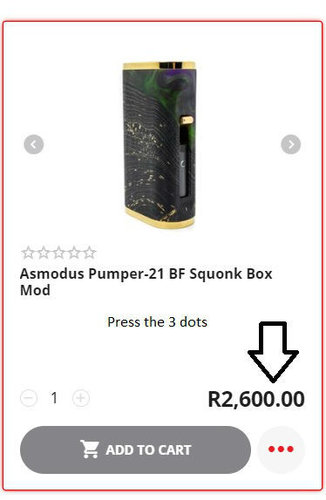
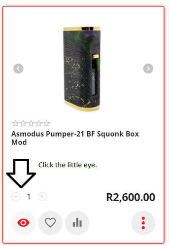
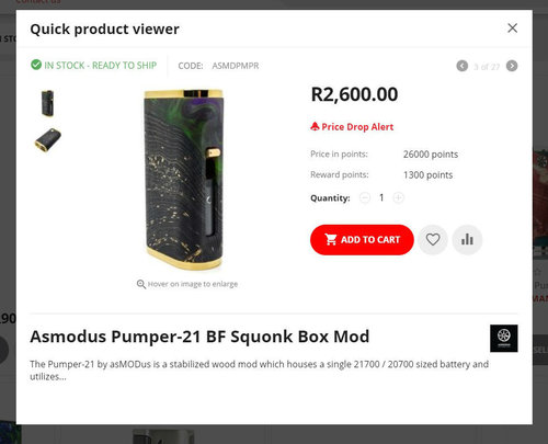
As for quickview we have had this since 2014. Here is how to use it on our new website.
1.jpg 2.jpg 3.jpg
 
Brilliant @Gizmo! I noticed it this morning and also the "Latest Arrivals" has moved to a more prominent spot! Chicken Dinner!
 
As for other features suggested here we already have:

Suggestive search ( as you type it brings down live results )
Filtering for in stock only ( Has been active since 2015 )
Minimized Categories ( we fully belive in making it as less clicks as possible to get you where you want to be )
Automated Free Shipping based on value ( Since 2013 - no code required )

Need further discussion:

We would like to enable QTY on hand for you but we fear it gives out too much information from a pure security point of view. From competitors to criminals.
 
Back
Top