Navigation
Install the app
How to install the app on iOS
Follow along with the video below to see how to install our site as a web app on your home screen.

Note: This feature currently requires accessing the site using the built-in Safari browser.
More options
You are using an out of date browser. It may not display this or other websites correctly.
You should upgrade or use an alternative browser.
You should upgrade or use an alternative browser.
The Flavour Mill - New Label Design
- Thread starter DizZa
- Start date
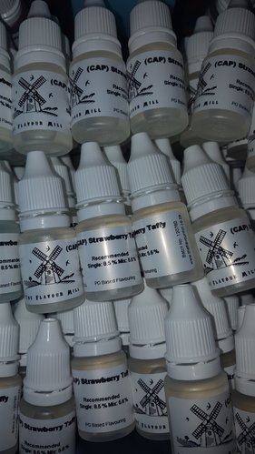
Looks good, @DizZa. My only humble request is to make the flavour name as large as possible. I need reading glasses and general use glasses. Many vendors have label names so tiny that I have to put my reading glasses on to find the bottle in my stash, then put my general glasses on to read the % off the mixing app on my screen. Your current labels are perfect size names, I always find your concentrates very easily.
Looks good, @DizZa. My only humble request is to make the flavour name as large as possible. I need reading glasses and general use glasses. Many vendors have label names so tiny that I have to put my reading glasses on to find the bottle in my stash, then put my general glasses on to read the % off the mixing app on my screen. Your current labels are perfect size names, I always find your concentrates very easily.
Noted thanks @RichJB
I like it @DizZa , I am a big fan of the fact that your bottles have a recommend % (for Newbs like Me).
I like that you have a Batch ID on them too, And agree with @RichJB on the Flavor Size.
I guess I liked the Color on the old labels just a teeny tiny bit more, definitely not a big thing but for some color and Graphics are one of the things that draw to a purchase.
With that said, This new one kinda gives it that "Authentic" feel of a Flavor mill, If that makes sense?
I liked the colour to be honest, however the black and white is alright too I guess. I understand cost is a real thing too though.
The larger the name, the better. The fonts looked better on the previous labels too I feel. I enjoyed that light wood background and all as well.
The larger the name, the better. The fonts looked better on the previous labels too I feel. I enjoyed that light wood background and all as well.
I liked the colour to be honest, however the black and white is alright too I guess. I understand cost is a real thing too though.
The larger the name, the better. The fonts looked better on the previous labels too I feel. I enjoyed that light wood background and all as well.
Hi @PsyCLown thanks for the feedback. We didn't go for cost effectiveness. This is a far better quality and more expensive label.
We were going for the feel of the way the manufacturers actually print their labels.
In hand it does feel a lot better than what photos do it justice.
We also feel that the batch number would provide us with not only a lot of control over stock aging but also for re-order purposes.
Nice thing about this is we can adjust on the fly, so constant feedback is really appreciated!
And again thanks for your continious support @PsyCLown
Looks nice.
I like it.
Once I get some new ones, I'll compare to the old and get back with more informed comments
Sent from my iPhone 7+ using Tapatalk
I like it.
Once I get some new ones, I'll compare to the old and get back with more informed comments
Sent from my iPhone 7+ using Tapatalk
Similar threads
- Replies
- 41
- Views
- 3K
- Replies
- 254
- Views
- 28K


