
Just thought a small refresh could be nice.
The up arrow I still need to fix otherwise opinions?
The up arrow I still need to fix otherwise opinions?
Follow along with the video below to see how to install our site as a web app on your home screen.

Note: This feature currently requires accessing the site using the built-in Safari browser.
Just my opinion, if the others like it more on the left, I can live with it.Cool, so sidebar better on the right?
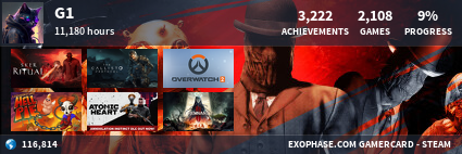
") maybe slighly bigger circles and those thread and post stats under all the topics could maybe be a more subdued colour so as not to distract from the forum headings
maybe slighly bigger circles and those thread and post stats under all the topics could maybe be a more subdued colour so as not to distract from the forum headings
the alert double please is ok now, but a new typo has cropped up
"introduce themeselves in Newbies Corner"